


We know the impact colours can have on our home interiors and home dwellers. Colour can be subtle or bold, merging in the background or standing out on a daring ascent wall. Either way, colours are the core requirement to the aesthetics of any décor. Given the mind-boggling choice and a multitude of shades available to us, things can get very confusing. Sometimes, we simply ask a friend or family member to decide. However, the outcome may still not be satisfactory, and therefore, there is a tendency to stay with time-tested hues.
Back in the 70’s colour meant bold and vibrant, before homes went mostly neutral. The pendulum has swung back again with bolder, vibrant hues in trend again. You can take a cue from these latest violets and oranges, but in the end, go with the colours that please you and your home. Let your heart’s desires take over and create a haven of your very own!
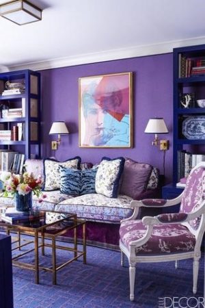
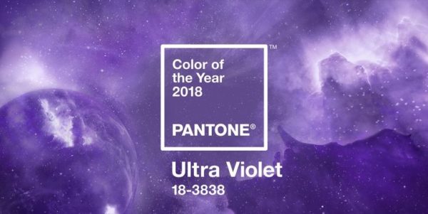
Pantone believes that “The Pantone Color of the Year” has come to embody the trends and sensibilities that are currently prevailing and are likely to be seen among those that influence trendsetting goals and ideas. Moving away from the subtlety of pastels and neutrals, ultra violet is clearly the surprise package. It empowers the designer to go bold, wild and beyond the ordinary when using colour to highlight, style and represent the prevailing mood of the creation.
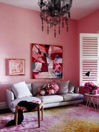
Pink spells fun, it brings back childhood memories, it reminds you of bubble gum and candy floss. It’s girly, subtle and delightful!
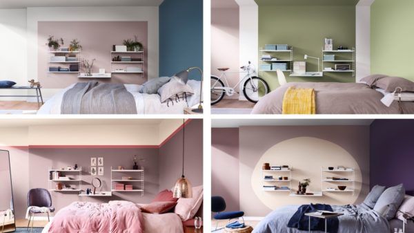
Dulux chose Heart Wood, a warm tone of Pink, recommended by experts at the Dulux Global Aesthetic Centre. Dulux foresees a versatile use of Heart Wood for interiors whether they are cosy, energetic or relaxed. Staying with the tried and tested, the colour seems to restore balance in a much fast passed and harried modern living.
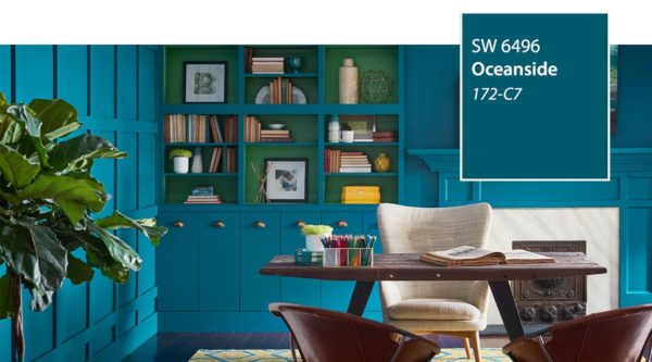
Blue and Green are all time favourites for stylish home interiors. Blue is calming, de-stressing and symbolic of intelligence.
Sherwin Williams played it safe by using blue-greens with Oceanside, a jewel-toned green, a colour which finds easy acceptance and yet creates an impact. Reminiscent of the ocean and the mid-century mindset, it is both traditional and contemporary in approach.
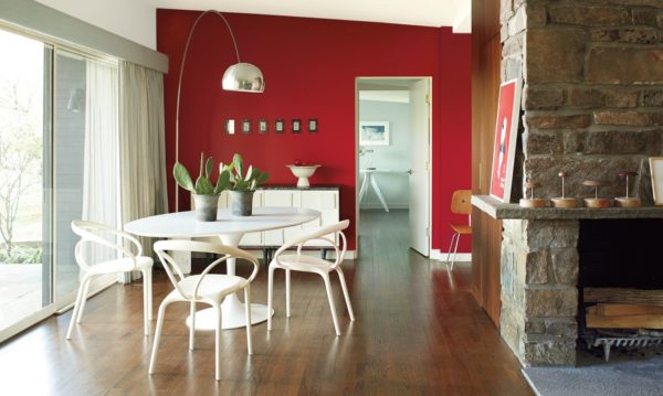
The powerful reds, oranges and yellows are making a comeback. Red is hot and brings warmth. The hue that can’t be missed, the bold and racy Red called ‘Caliente’ was the Benjamin Moore favourite. Red is the colour of modern architectural masterpieces, red carpets, love, vitality and a whole lot more. Burgundy red also seems to be seen everywhere this year.
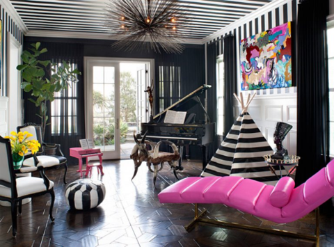
The two complementary neutrals of black and white are classics-effortless and cool. Black is the new blue with most trending interior decorators proffering to use more of this underutilized yet glamourous colour.
If you are kick starting your home colouring project this year, you can check horde of colours shared by more than 100 interior designers, on the latest trends, opinions and get an inspiring, trendy home.
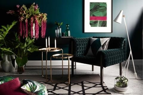
Who doesn’t love the colours of the Ocean? Turquoise and Green are cool colours that continue to set new trends and grace many a stylish home. Pantone 2017 Greenery continues its march in 2018 along with other shades of green- sage, celery and avocado greens. Nature is magical and continues to awe us.

 POSTED BY