


Despite how quickly digital marketing has taken off, real estate agents still rely on catalogues, brochures, pamphlets, and other print marketing materials to reach out to their clients. It is a crucial component of any marketing campaign and print media helps realtors to reach their target market, as clients tend to prefer using print when searching for property.
Here are 10 different print marketing examples that have helped realtors grow.
The Enclave Apartments Tuck Tab Folder
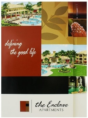
The cover design on the enclave apartments folder features photographs with illustrations to show the lavish design of apartments and homes for sale. A feature beneficial for estate agents is a V4 slit on the right pocket, which is used to store business cards.
The Villas at Cortez Presentation Folder
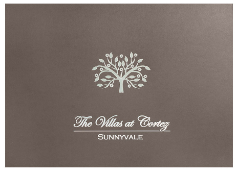
The metallic platinum foil stamped area on one side of this folder highlights luxury. With its distinctive style of a landscape layout, it opens like an invitation beckoning clients to see the homes for sale. With two sets of business card slots on the right pocket, this is beneficial for realtors.
Cepimmo Business Card
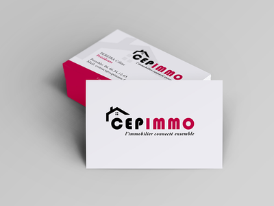
The Cempimmo business cards use colour to their advantage. Whilst fluorescent pink may not work with some designs, it certainly does here. The front face of the cards is white so the colour doesn’t distract from the logo, but the outside of the cards is coated in the bright pink for effect. If you handed these cards out, they’d be sure to catch client’s eyes.
Leidel Homes Landscape Folder
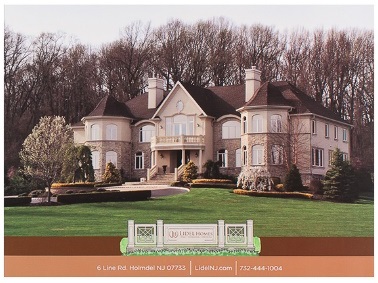
Every aspect of The Lidel Homes folder is structured and used well to ensure home buyers are thoroughly informed about the homes. Brochures are provided in the right pocket as well as slits for business cards. This folder is great for estate agents as the brand logo and contact info is strategically placed well on both the front and back of the design.
Skybridge Lofts Pocket Folders
The logo appears on both of the interior panels in this Skybridge Lofts folder to ensure customers will see it when removing documents from either pockets. Hints of the colour green have been used, within the text and inside the folder to emphasise the theme of eco-friendliness. Again, card slots are inserted in the right pocket and due to the minimal design of the covers, clients can easily see the contact information and logo on the back.
Beverley Hills II Brochure
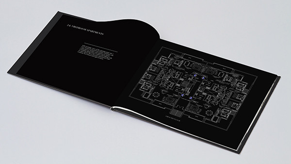
This contemporary brochure design is beautifully designed. None of the inner pages are overcrowded and the black background enables the images to stand out significantly. This brochure is more like a book than a folder which adds to the luxury of the design and the property within.
RE/MAX Sea to Sky Folder
Both interior panels of this folder have pockets on each side for homebuyers to store documents inside. Regular paper can be placed inside the left pocket, and the right box pocket can house thicker items such as brochures that essentially may tear an ordinary pocket. This folder is made to benefit the homebuyers as the style is to ensure their real estate documents are comfortable in the folder.
Dunes Real Estate Group Folder
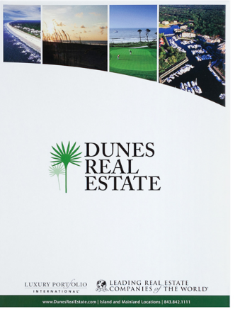
The use of white being the main theme colour of this Dunes Real Estate Group folder means the logo, company name and details can be easily seen by home buyers. Inside the folder is a brochure slit on the left pocket as well as business card slots on the right pocket ensuring buyers get all the needed information from this real estate folder. The URL is featured on the back cover to encourage customers to search the company online for easier accessibility to extra info and images of potential homes.
Shupilov Flyer
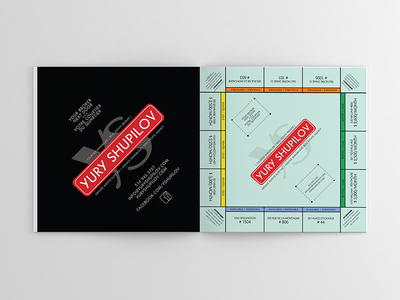
Straight away, you can see why this Shupilov flyer stands out so well. The clever design represents the instantly recognisable Monopoly board which will grab anyone’s attention. If you want to get noticed and win people over, this is how you do it.
Berks New Homes Presentation Folder
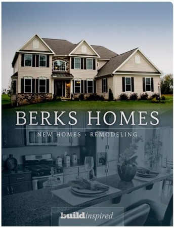
The Berks New Homes Presentation Folder uses photography to showcase the property. The colours complement each other well and actually represent Berk’s brand. Using brand colours always works well in marketing as it maintains your brand identity, which clients will remember. Inside the folder are diagonal pockets and business card slits.
If you want your print marketing to stand out, the above 10 examples are designs you should try to follow. Your brand will bolster, your client base will increase and your properties will be much more sellable!

 POSTED BY