


OK, so summer doesn’t officially end until October, but you may have noticed that the rain has begun to fall, the evenings are getting longer and the days are getting shorter. Oh, and the infamous pumpkin spiced lattes have already sprung up in Starbucks; it is only a matter of time until the leafs will descend from the trees and you will be swapping summer BBQs in favour of a snuggled movie marathon, drinking copious amounts of hot chocolate under a blanket.
But, fear not! For with every change of the season comes new design trends, which bring new ‘in’ colours and styles for you and your home.
We have consulted the A/W Pantone colour report and compiled a list of the latest colour trends and how to use them within your home. Expect to see plenty of tranquil blues, grays, warm reds and playful pinks in the up and coming cold seasons.
Riverside (Pantone 17-4028)
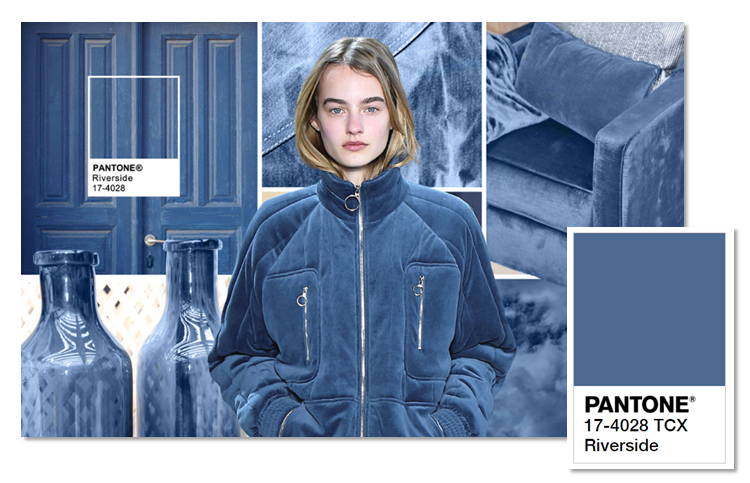
Image source http://www.pantone.com/fashion-color-report-fall-2016#riverside
This blue hue is cool and calming and oozes sophistication and class. The tone is not overbearing, which would allow more statement pieces in your home to speak out, and would be the perfect base colour for any room. It may be a bit darker than your usual wall colour, but don’t be put off by thinking that it will make your room look smaller. Dark colours can actually create the illusion that a room is bigger than it is, providing that it is used properly.
Airy Blue (Pantone 14-4122)
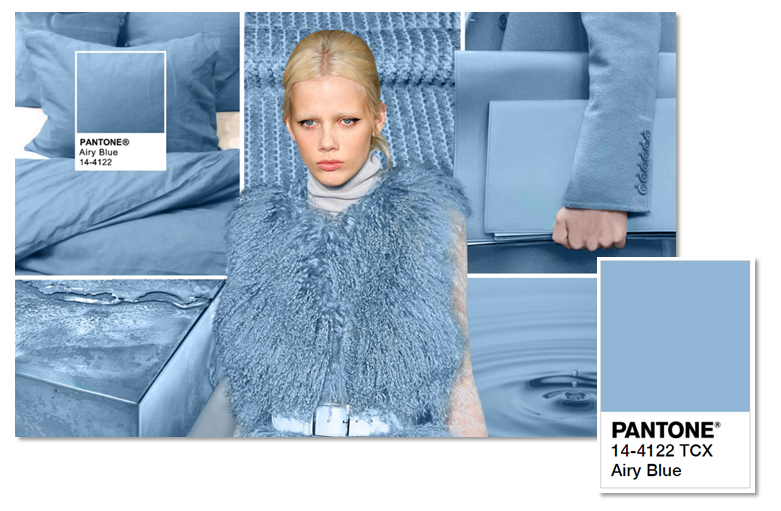
Image source: http://www.pantone.com/fashion-color-report-fall-2016#airy-blue
Sure, this shade isn’t exactly the warming tone that you’d expect of A/W, but there is no denying how serene this tone is. It is almost exactly like you have walked out of a ski chalet and woken up to a cloud-free sky; this shade transports you out of a conflict filled world, and takes you somewhere far calmer and more relaxing. For the perfect ice palace feel, team with plenty of silver accessories, or for a fresher approach, go to pinks and greens.
Sharkskin (Pantone 17-3914)
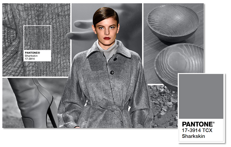
Imagine source: http://www.pantone.com/fashion-color-report-fall-2016#sharkskin
This grey shade is so versatile that you could pair it with almost any autumnal colour and it will still look elegant and classy. Much like Riverside, this is a perfect hue to work with other colours to allow them to stand out. For a more subtle and muted room, pair with dusty pinks or blues, but for a more dramatic effect team with bright reds and greens; adaptable for any time of year or style.
Aurora Red (Pantone 18-1550)
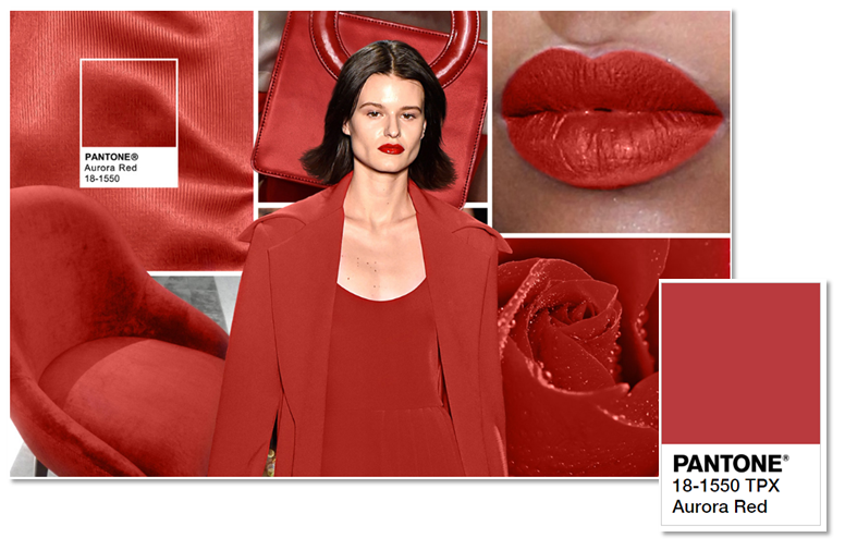
Image source: http://www.pantone.com/fashion-color-report-fall-2016#aurora-red
This warm, dramatic red is obviously a perfect autumnal hue, creating warmth and emulating glamour, which is instantly pleasing to the eye. While an all-red is more acceptable in terms of fashion, for decor reds tend to work better as statement accessories: red sofas, kitchen appliances, bed sheets, etc. Layer Aurora Red on top of Sharkskin for a sophisticated feel, or go with Riverside or Lush Meadow for a more daring, exotic effect. What is the best thing about this shade, is that unlike ruby red, it is slightly more subtle in its vibrancy.
Warm Taupe (Pantone 16-1318)
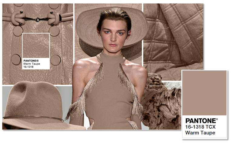
Image source: http://www.pantone.com/fashion-color-report-fall-2016#warm-taupe
Beige can be, well, bland and boring. However, whether you like it or not, it is a classic decor colour, and need not look dull at all, provided that it is used properly. This natural, earthy tone would work well in a modern home, and would set more vibrant colours off, such as Riverside and Aurora Red, allowing them to stand out. But please, please, please, do not paint all of your walls and furnish your entire house in just this one colour, unless you want it to look like you’ve wandered into the desert.
Dusty Cedar (Pantone 18-1630)
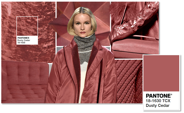
Ok, sure, we are more used to seeing pretty pinks in Spring and summer, but you’d notice that this hue has warmer undertones, which makes it near perfect for A/W. Not only this, but the worlds of fashion and decor have gone mad for shades of pink this year, with rose-quartz even being named ‘colour of the year’. This warm, dusty shade would work harmoniously with Sharkskin or Airy Blue, making your home an environment of serendipity and relaxation.
Lush Meadow (Pantone 18-5845)
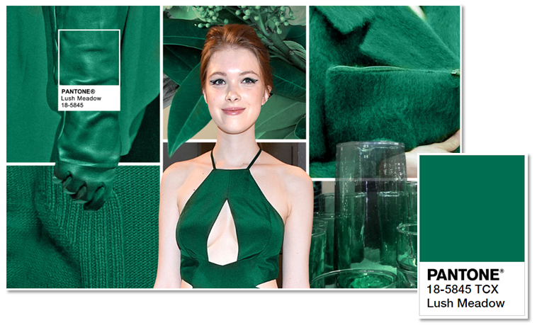
Image source: http://www.pantone.com/fashion-color-report-fall-2016#lush-meadow
Unlike a lot of greens, Lush Meadow has a much deeper, complex hue, which sets it apart from the rest. With how deep this green is, it emulates glamour, vibrancy and elegance, and having this colour in your home would make it feel warm and botanical all year round- not to mention, this shade would be perfect for Christmas! That being said, unless you want your home to feel like Santa’s grotto, avoid pairing this colour with red shades at all costs. The daring among us may want to team Lush Meadow with Bodacious, or for those who are more traditional, team with shades such as Sharkskin, Warm Taupe or Potter’s Clay. For the ultimate decadent feel, go with Spicy Mustard.
Spicy Mustard (Pantone 14-0952)
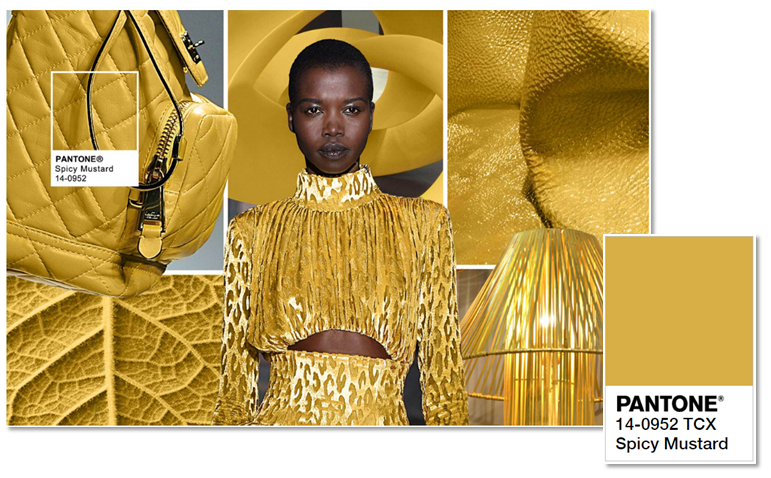
Image source: http://www.pantone.com/fashion-color-report-fall-2016#spicy-mustard
It seems this A/W 2016 is packed full of rich and vibrant shades, and Spicy Mustard certainly does not disappoint. This shade is uplifting, and would add a touch of warmth into any home. While it may be quite risky, larger rooms can really shine when painted in yellow, providing that you use complimentary colours to match. However, many of us may not have a room large enough, or the guts, to paint yellow, so instead, be more subtle and team Spicy Mustard accessories with a Sharkskin base.
Potter’s Clay (Pantone 18-1340)
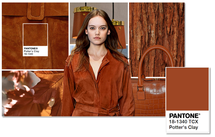
Image source: http://www.pantone.com/fashion-color-report-fall-2016#potters-clay
Autumn just wouldn’t be autumn without a truly earthy colour. With undertones of orange and brown, this shade is representative of the falling leafs of autumn. But, admittedly, having this shade in your home in spring and summer would be slightly out of touch, right? So, the best option would be to go for smaller accessories, such as rustic pots, or if you’re willing to spend a bit more cash, get yourself a classic Chesterfield sofa and get a throw in Lush Meadow: perfect.
Bodacious (Pantone 17-3240)
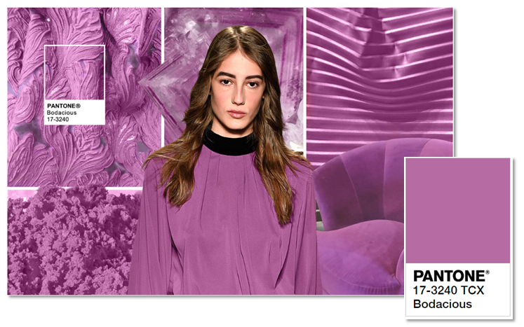
Image source: http://www.pantone.com/fashion-color-report-fall-2016#bodacious
Perhaps the most unexpected of all, thanks to its vibrant pink/purple tone, Bodacious is one of the newest autumn colours for 2016. This shade would be perfect to make a statement in your home- think Bodacious soft furnishings setting off against paler shades, such as Airy Blue or Sharkskin, or for a more dramatic effect, choose a base colour such as Riverside. However, unless you want a Little Mermaid themed home, avoid tones such as Lush Meadow.

 POSTED BY