

Home Improvement Tips:
How to use paint and colour to really make your skirting boards and architraves work for you!
For decades (if not longer), we’ve been told that white is the only colour for skirting boards, architraves, and all the other internal mouldings in a house. Moreover, most of us have slavishly followed this flawed wisdom, never even considering using another colour, no matter what else we do with the rest of the place.
Thankfully, people realise that white isn’t always right, and they’re looking for ways to paint their mouldings that will stand out or blend in if that’s what they’re after.
There is a wide selection of skirting board providers out there nowadays; you may want to try one of these decorating ideas once you’ve got them in place.
Pairing light-coloured walls with a darker trim
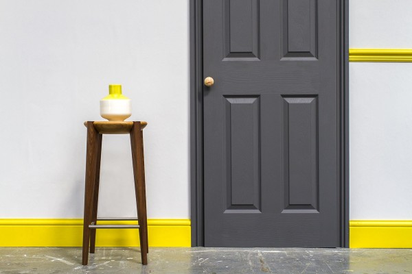
Although using a darker colour on skirtings and architraves is a modern trend, it can also fit in quite well with more traditional décor plans. Using contrasting colours can create the illusion of more space by drawing the eye along the wall’s expanse; it also frames the larger areas of lighter walls, making them seem more significant than they are.
Using a darker colour on skirting boards also helps to minimise the appearance of scuffs and grime. Bright white paint, especially gloss, really shows up dirt and dust, and while a darker colour will still gather the dust, it’ll be less obvious, mainly if you use matt paint.
If you’re a contrast newbie, think about a soft dark grey first, as this colour works well with pretty much any colour you care to pair it with. Once you feel more confident, you can swap over to a more vibrant colour further on down the line if you fancy it.
Painting the mouldings in the same colour as the walls
This old-fashioned idea from the Georgian era is making a real comeback. This technique works particularly well in smaller spaces as there are no contrasting lines to demarcate walls, doors and floors. It’s also brilliant when used in a room with an accurate statement colour – otherwise, you have a bold hue on the walls and then…good old white gloss to bring us back to 1984.
Use different shades of white.
If using dark grey or orange or any other colour doesn’t work for you, your taste and the overarching theme in your house, then you don’t have to do it! You can choose from a rather staggering number of whites – Dulux alone sells more than 30 shades and hues – to complement the rest of your décor.
The various whites available have undertones of different colours, so if you’ve opted for a soft yellow along your walls, you can match your off-white mouldings perfectly. Not everyone wants strong contrasts and dividing lines, so this is the ideal compromise.

 POSTED BY