


Ugly, Terrible, Hideous and Bizarre Houses!
Here are our picks for the ugliest houses and most hideous home decor from around the world
In my usual posts I mainly focus on the positives of home décor and show you how to create great spaces in different ways. However, for this article I thought I would offer something a bit different and show you some of the WORST home décor offenders around. This is my guide for ‘what not to do’ when decorating your home.

Whilst I completely support and understand that everyone is entitled to their own personal style and wouldn’t want to judge anyone, in the examples I have chosen I am really struggling to understand how these rooms came about! They are truly awful and I hope they have been updated since the pictures were taken!
1) Fluffy Bathroom
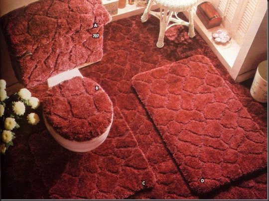
Source: Apartmenttherapy
Personally, I think carpet in a bathroom is always wrong. However, when the carpet overtakes the whole room it makes it even more terrible. I don’t understand why anyone would think that their toilet needs a carpeted cover! What is its function? The other thing confusing me is that they had added bath and toilet mats IN THE SAME MATERIAL (?!) maybe just in case your feet weren’t warm enough or your floor not soggy enough when you get out of the shower?
2) Footballer Faux Pas
Source: Daily Mail
According to the Daily Mail, this picture prompted users of Instagram to deem footballer Andy Carroll’s living room to be the ‘worst room ever’. I have to tell you that I agree with them. The worst thing about this is that with the amount of money footballers earn, I’m sure he could afford a decent interior designer. This room looks like it should be the interior of a dodgy strip club or a tacky nightclub. As if the pink leather sofa isn’t bad enough, they have paired it with SO MUCH ZEBRA print. I just can’t take it!
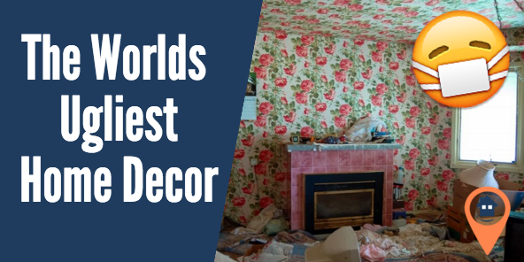
3) Floral Overload
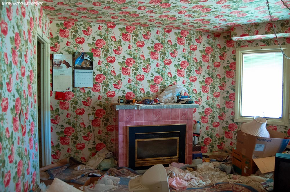
Source: Huffington Post
I am partial to a bit of floral wallpaper every now and then, maybe the odd feature wall or a small floral inspired room, but this just looks like Cath Kidston has projectile vomited everywhere! It wouldn’t actually be too bad but I don’t know why the ceiling is in the same print? I can imagine waking up in this room with a stonking hangover, would feel like you were in a swirling floral nightmare!
4) Plaid Out
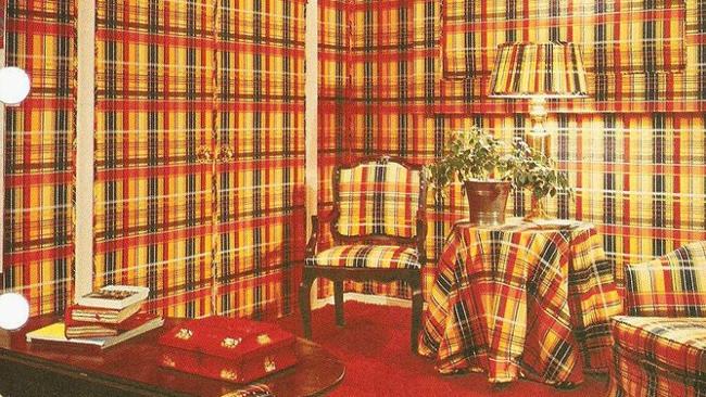
Source: Pinterest
Another classic case of taking a theme and going too far. It’s like the culprit completed the wallpaper and found great chairs to match. The then thought… ‘I know what would make this room nicer!’
5) Yellow Peril
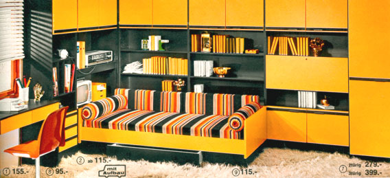
Source: Chelseacoryell
This style makes me feel a bit ill (is interior design this bad a cause for incarceration in an asylum?) I think it definitely should be for the safety of others. Perhaps if the sofa was in a simpler room, it could work well as a focal point, or if there were fewer cabinets paired with simple furniture, it could also be quite nice. Incorporating a fluted panel could add a sophisticated touch without overwhelming the space But the combination of the two and all that yellow is just too much. Please keep it simple, people!
6) Interior Design Crime Scene
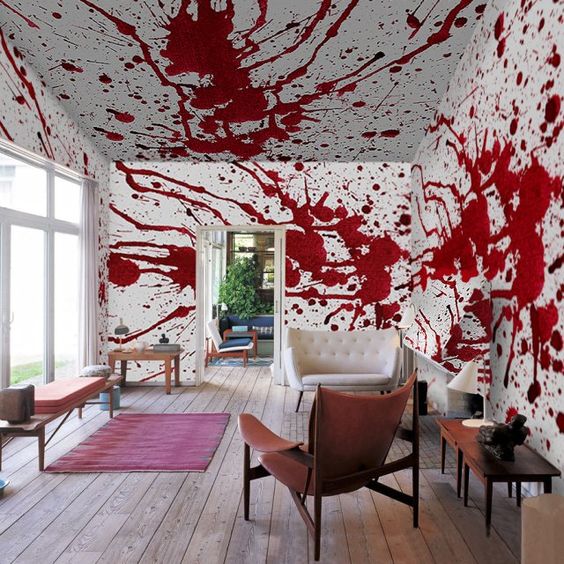
Source: Pinterest
This space just makes me feel like I am a bystander in an episode of Dexter after he’s just completed one of his many murders in his particular room. When I am chilling in my living room, I don’t want to be reminded of a crime scene, I want to relax! The only positive is that the rest of the room is kept simple; however, this just makes me focus more on the atrocious wall design. The scale of the print is all wrong, if they scaled it down and included other colours and turned it into a wallpaper, it could be considered artsy.
7) The Grass Isn’t Always Greener
Source: Uglyhousephotos
Only one word comes to mind when I see this image; astro-turf grass. This carpeting is so bad that it trumps the terrible sofa patterns! This look is perfect if you want your living room to resemble an artificial lawn!
If you’re looking for a home in Winter Park, FL with a natural landscape garden, then choose one that has great carpeting. You can also choose a practical carpet that’s functional for your living room and would not require carpet cleaning too often. For instance, you can invest in polypropylene, which is a popular material for indoors. This carpet type is stain-resistant, affordable, and can resist fading. Wool is another carpet material that’s extremely soft and beautiful to look at. This material is a natural way to conceal stains.
8) Cellar Dining? Really?
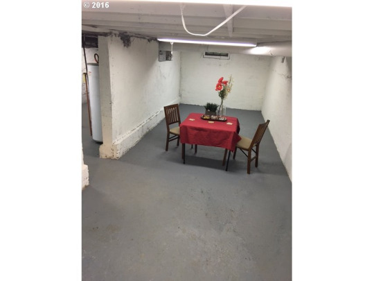
Source: Terriblerealestatephotos
To give these people credit, I have to say that at least they tried to make an effort, but a well-dressed dining table is out of place in this creepy-looking cellar. It looks very ominous and I would be very scared if I was invited round to dinner here!
I believe that a wine room can increase the appraisal value of a property. A wine cellar or room makes a major investment for your home. However, you need to ensure that your cellar is located in the right place.
9) Just So Much Shag!
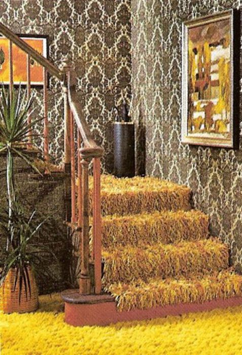
Source: Pinterest
I know shag carpet and printed wallpaper used to be a bit of a trend, but this much is really overdoing it. The carpeted stairs look as if a Muppet has been molting on his way to bed. When it’s combined with the bright artwork, loud wallpaper and the spiky plant, you would be the laughing stock of your street when you invite people in.
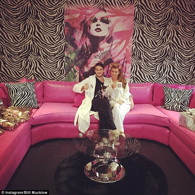
10) Warning! This Zebra Bites Back!
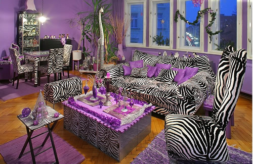
Source: so interiors
It looks as though Andy Carroll (number 2 on the list) isn’t the only one who likes this terrible style. I find it hard to believe that more than one person would want to create this look in their home! What made them look at all that zebra print and think ‘that is the PERFECT amount of zebra for my relaxing living space’. I beseech thee: please stop the excessive zebra print!
11) Too Many Toys
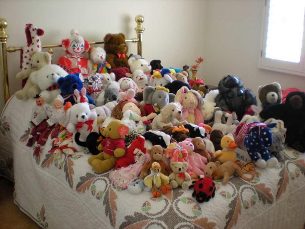
Too many toys like this can be so creepy and put off potential buyers of your home. Just put them away for when you have visitors or just move on and donate them to your local charity shop, you will thank me later!
You don’t only want to have a beautiful home but also a safe and healthy living space. Aside from organizing and disposing of toys, it’s important to declutter your home. Recycling, reusing, and repurposing materials such as plastics, paper, cartons, vinyl, and fabrics can help reduce the amount of trash that ends up in landfills. Of course, this can also help beautify and make your home cleaner and more organized.
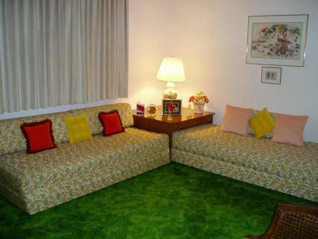
12) Pink and Green Velvet Disaster
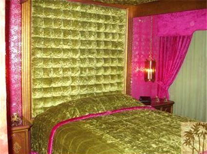
Pink and green is one of the colour combinations you need to be very careful about using when decorating your home and they should definitely be kept to a minimum. Instead, try using accents of these colours, rather than submerging the whole room in them. Clearly these guys didn’t get that particular memo….
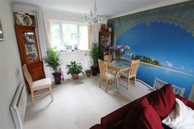
13) Work of art?
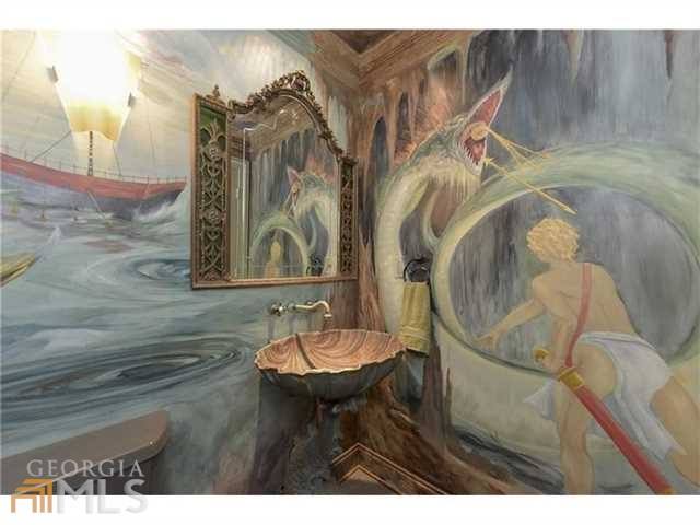
Source: Terriblerealestateagentphotos
This mural should be condemned for nightmare inducement. It’s much too hectic to encounter whilst brushing your teeth every morning, also can you imagine walking in here after a few drinks? Or even how you would explain it to an overnight guest? I’m shuddering at the shame.
When adding a work of art, make sure it appeals to everyone, most especially to your family members. Don’t just think of the artist or the price tag, you also need to consider its overall effects on your interior.
14) Dodgy Dining Room
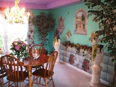
Source: Pinterest
As we have seen, murals are really tricky to get right, see exhibit B. It gives me the impression of being half finished and what’s with that floating window? When you factor in the addition of the weird statues, fake looking trees and the chandelier, it just hurts my eyes!
15) Did you get a special on those bricks Mike?
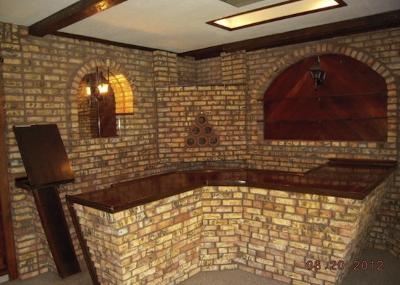
Source: Yourhomeislovely
This is supposed to be a bar but it looks more like a brick shop. I don’t understand why anyone would want all this exposed brick as a bar? Especially when it’s paired with that dark work which makes the room look extra dingy. This poor feature is screaming out in pain for a ‘Do Over’.
16) An Antique Hash
Source: Decorgirl
I don’t actually mind some elements of this room but they should have stuck to one style rather than four. The blue items wouldn’t actually look too bad in a simple white modern room. Equally, the darker and more antique looking items may work together in the room by themselves. The toxic mixture of colours, textures and patterns is just too much. The worst part about this room is the missed potential!
17) A Terrible Wall Paper Choice
Source: Terriblerealestateagentphotos
You know that feeling where you have had a long day at work and you just want to book a holiday? This mural looks like they have stolen the background of a travel agency from an industry conference. It just looks like a weird afterthought for this room. Get some better inspiration by checking out these feature wall ideas.
18) What A Horror Show!
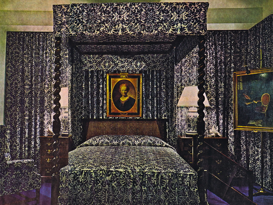
Source: Creativepro
This room is going to give me night terrors. This is all made worse by the creepy picture above the bed. I definitely would not be getting much sleep in here!
19) The Avocado Bathroom: A 70’s shocker!
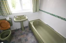
Once a dream feature for your home (back in the 70’s that is), the avocado bathroom is eponymous with being on the top of UK TV interior design show’s Room 101 list. Not only does this retro design look massively dated and ugly, it can also have a damaging effect on the value of your property by knocking off a huge £8,000! However, with the revival of 60’s and 70’s interiors this year, the dreaded avocado bathroom is having a bit of a come-back. If you still can’t relinquish this eyesore from your home, at least give it a stylish update as seen here. Let’s just put it this way, I really hope that you do!
20) THE Worst Bathroom Ever!
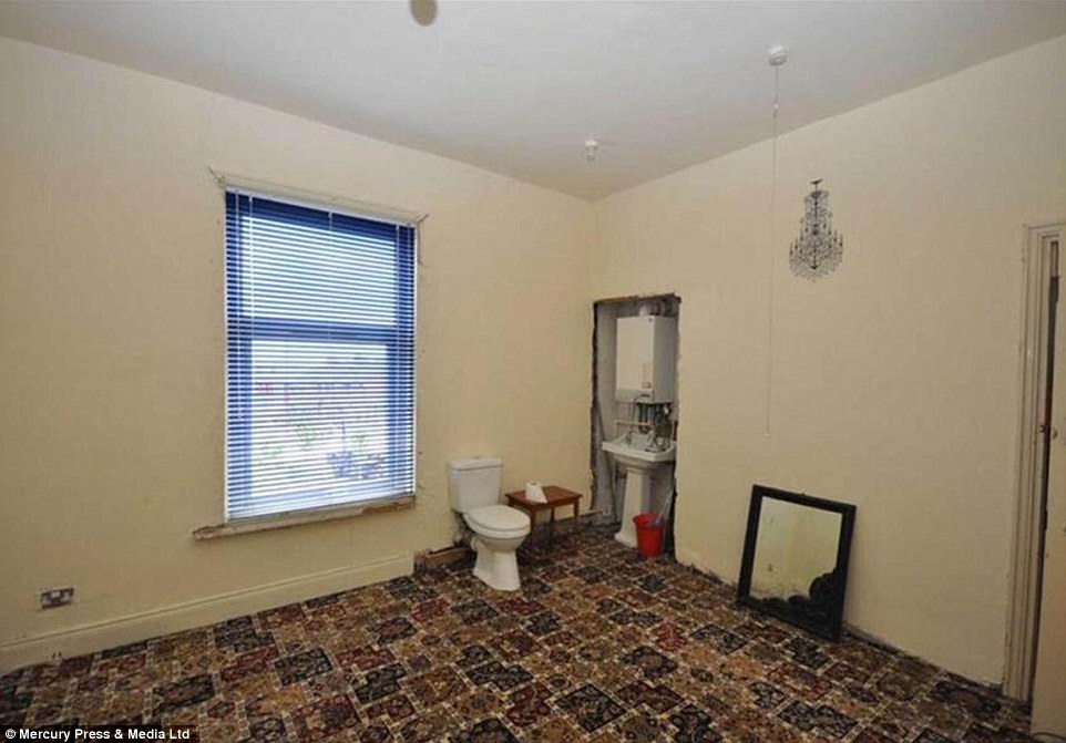
Source: DailyMail
I particularly love how they have put the sink in a dingy cut-out hole in the wall. Stylish! I just can’t look at this picture for too long as it makes me so sad and confused. My favourite feature is the wall design that looks like a chandelier sticker; to give it that elegant edge!
This list actually makes me quite sad. I don’t know how people can get it so wrong! I mean, where all of these genuinely thought through? Either way, I urge you, please don’t copy these styles at home. It shouldn’t be this easy to get it so wrong and I just hope that all of these decorators got the help they so desperately needed!
To check out some much more attractive houses, flats, apartments and studios, visit TheHouseShop and find your dream home today!

 POSTED BY